There’s something strangely satisfying about booking an appointment online and knowing the job is done. No phone calls. No waiting for someone to answer. No awkward back-and-forth messages trying to find a time that works for everybody.
For businesses, that convenience can be just as valuable. A customer who can quickly see available times, choose a service and confirm an appointment is much more likely to complete the process.
That’s the real purpose of a Booking & Appointment Website. It shouldn’t simply display a calendar and call itself a booking system. It should make scheduling feel simple, trustworthy and almost effortless.
Related node: When Your Website Feels Outdated, It May Be Time for a Fresh Start · Building an App Is Only the Beginning: What Makes a Mobile Experience Last · Basic Accounting Terms Every Small Business Owner Should Know
Start With the Customer’s Journey
Before choosing a booking plugin, calendar design or payment system, think about what the customer actually experiences.
Imagine someone searching for a local salon after work. They’re tired, probably on their phone, and they want to know three things: what services are available, how much they cost, and when they can come in.
If the website answers those questions quickly, the customer keeps going.
Related node: Entrepreneurship vs Job: Which Is Better in 2026? · Social Media Marketing Strategy to Grow Your Brand in 2026
If they have to hunt through several pages, create an account before seeing availability, or fill out a long form just to request a time, frustration creeps in.
The best booking experiences remove unnecessary steps. Not every business needs a complicated system. Often, simpler is better.
Your Calendar Should Be Easy to Understand
An online calendar can either be wonderfully convenient or surprisingly confusing.
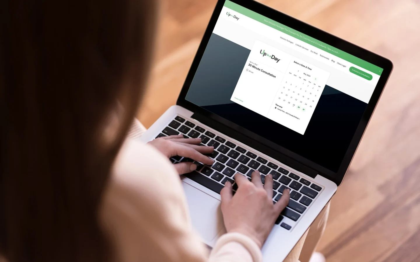
Available dates should be obvious. Unavailable times shouldn’t look selectable. If appointments have different durations, those differences should be explained clearly.
For example, a 30-minute consultation and a two-hour service shouldn’t appear as if they’re basically the same appointment.
Businesses should also think about what happens after someone books. A confirmation email or message can reassure customers that everything went through successfully. It may seem like a tiny detail, but that little “Your appointment is confirmed” message removes a lot of uncertainty.
Mobile Booking Is No Longer Optional
Most people don’t sit down at a desktop computer specifically to make an appointment. They do it whenever the thought occurs to them.
Maybe they’re standing in a supermarket queue. Maybe they remember they need a dental appointment while sitting on the sofa. Maybe they’re browsing during a lunch break.
That means the booking process needs to work properly on smaller screens.
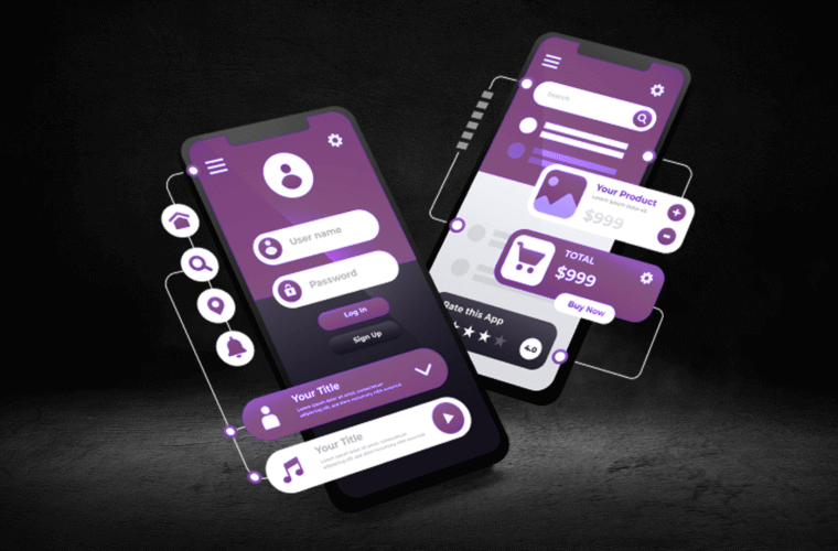
Buttons should be large enough to tap. Forms should be short. Dates and times should be readable without zooming. Payment pages, if required, should feel secure and familiar.
A mobile user shouldn’t have to pinch and scroll their way through an appointment.
A Landing Page Can Help Focus Attention
For businesses running advertising campaigns or promoting a particular service, a dedicated Landing Page can be incredibly useful.
Instead of sending visitors to a general homepage filled with different messages, a landing page can focus on one offer or action. For example, a fitness studio promoting a free consultation might create a page explaining that consultation, answering common questions and providing one clear booking button.
That focused approach reduces distractions.
The visitor doesn’t need to wonder where to click next. The page has one job, and everything on it supports that job.
Show the Information People Actually Need
Customers hesitate when important details are missing.
Before booking, people may want to know the price, appointment duration, cancellation policy, location, available services or what they should bring.
Don’t make them dig through an FAQ page if the information can be provided naturally on the booking page.
Transparency builds confidence.
If a service takes 90 minutes, say so. If cancellations need to be made 24 hours in advance, explain it. If there is a deposit, make that clear before payment rather than surprising customers at the final step.
Nobody likes surprises when money is involved.
Trust Matters More Than Fancy Design
A booking website doesn’t need to look like a futuristic technology demo.
It needs to look trustworthy.
Professional photography, clear business information, customer reviews, secure payment options and consistent branding can all help. So can simple things such as displaying a phone number or physical address where appropriate.
Testimonials can be especially helpful for service businesses because customers are often buying an experience rather than a physical product.
A few genuine reviews can sometimes do more than a dozen decorative design elements.
Automate the Boring Stuff
One of the biggest advantages of online appointment systems is automation.
Once properly configured, a booking system can send confirmations, reminders and follow-up messages without someone in the office manually handling every appointment.
Reminders are particularly useful. People forget things. It happens.
A polite reminder the day before an appointment can reduce missed bookings and save staff from making unnecessary calls. Depending on the business, automated messages can also provide directions, preparation instructions or cancellation links.
Automation isn’t about making the business feel impersonal. Done well, it gives people more time to focus on actual customers.
Give Customers Control
A good booking system should make customers feel in control.
If possible, let them choose the service, date and time themselves. If appointments need approval rather than instant confirmation, explain that clearly.
It can also be helpful to allow customers to reschedule or cancel without having to call the business.
Of course, the exact setup depends on the industry. Medical practices, consultants, salons, tutors and repair businesses may all have different requirements.
The principle remains the same: make reasonable tasks easy.
Don’t Forget Accessibility
A website should work for as many people as possible.
Readable text, clear labels, good color contrast, keyboard-friendly navigation and properly structured forms can make the booking process easier for users with different needs.
Accessibility isn’t just a technical requirement or an SEO consideration. It’s basic good design.
If someone wants to book your service, they shouldn’t have to fight the website first.
Keep Improving After Launch
Launching an appointment website doesn’t mean every decision is final.
Look at where people abandon the booking process. Check which services are most popular. Pay attention to questions customers still ask. If many people contact your business because they can’t understand one part of the booking process, that’s useful feedback.
Small improvements can have surprisingly large effects.
Maybe shortening a form increases completed bookings. Perhaps moving the pricing information higher on the page reduces confusion. Sometimes the answer is something very simple.
The Best Booking Experience Feels Almost Invisible
When online scheduling works well, customers don’t really think about the technology behind it. They simply find a time, book it and move on with their day.
That’s the goal.
A successful appointment website isn’t measured by how many features it has. It’s measured by how easily real people can use it.
Keep the journey clear. Give customers useful information. Make mobile booking painless. Build trust. Automate repetitive tasks where it makes sense.
Do those things well, and your website becomes more than an online calendar. It becomes a quiet, dependable part of the business — one that keeps working even when everyone else has gone home.